In the world of technology, the terms “user interface” (UI) and “user experience” (UX) are commonly used (and sometimes interchangeably). What does becoming a UX or UI designer entail, and what do the phrases mean?
When using a website, app, or another electronic device, you interact with screens, buttons, toggles, icons, and other visual elements, referred to as user interfaces (UI). UX describes your overall experience using a product, including your feelings during that experience. Although UI can undoubtedly influence UX, the two are separate, as are the roles that designers perform.
In this blog, we’ll examine the differences between UI and UX design professions and how to decide which one you should pursue. Last but not least, we’ll talk about UI/UX design examples.
You’ll have a solid idea of what sets them apart at the end of this article. So let’s get started!
What is UI/UX Design?
User interface design describes the visual appeal of an application or website. Think about where icons are placed on a website and how they interact with one another in the digital world. Numerous design elements go into interface creation, such as font choice, colour scheme, images, button placement, and menu structure. When taken as a whole, these design choices help users understand what can be touched, clicked, or swiped, which button among a group is most important, and how to recognise calls to action.
The term “user experience,” or UX, refers to how a person interacts with a good or service. Think about trying to arrange a trip or doing some internet shopping. A user-friendly website or app that makes it simple to find what you’re looking for would be the best option. You swiftly complete your transaction and leave the shop. That’s exactly what we mean by a positive user experience!
Difference Between UI/UX Design
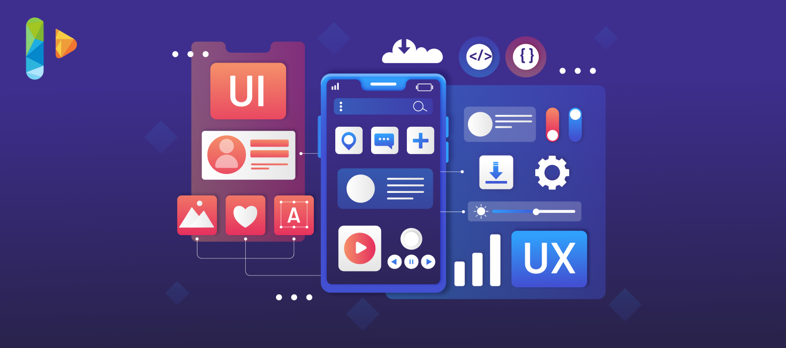
Strong UI and good UX are frequently necessary for creating products that people adore. For instance, you might have a banking app with a beautiful interface and simple navigation (UI). However, it doesn’t matter how attractive the app is if it loads slowly or requires you to go through multiple panels to transfer money (UX). Most likely, you won’t want to use it.
On the other hand, a website may be stuffed full of original, useful information that is arranged logically and intuitively. You’re more likely to leave a website if it appears outdated or needs help navigating through the options or moving between panels.
| UI designer | UX designer |
| Visual designer | Interaction designer |
| Chooses the font and color | Charts the user pathway |
| Plans visual aesthetic | Plans informative architecture |
| Expert in mockups, graphics, and layouts | Expert in wireframes, prototypes, and research |
UI/UX Design Example
1. Instagram:
Instagram has grown to be very popular. Due to its layout, users may navigate through the never-ending stream of visual content for extended periods without feeling overburdened. Even if most users needed clarification on what was so wonderful about Instagram’s visual balance and organisation, there is something inherently wonderful about it.
2. Telegram:
Likely, Telegram is less well-known than Whatsapp, its primary rival. However, its user experience (UX) design offers a considerate, attention-to-detail experience, a quality of a powerful UI/UX design example.
The first is a creative tab layout that makes it easier for users to manage the files they are given. Second, group chat administrators can “pin” messages so everyone can see them immediately.
3. ASOS:
ASOS offers an alluring online shopping experience. The ASOS landing page has attractive visuals and well-placed buttons.
Fashion e-commerce must be visually appealing while also ensuring that all users’ practical needs are satisfied. Customers are enticed by the ASOS landing page’s vibrant image splash, strategically positioned calls to action (CTAs), and navigation buttons, which encourage them to explore particular sections and products.
A clear visual hierarchy is present when a customer arrives at a particular product page. A size chart and other details are easily accessible, and since everything opens on the same page, there is little risk of losing visitors to new tabs. Users may quickly choose a size, view prices, and add items to their cart thanks to the smooth user interface.
4. Airbnb:
The website for Airbnb blends usability and design while assisting consumers in finding vacation rentals or hosting rentals for others.
The user needs of hosts and guests, two very diverse audiences, are met by Airbnb’s UX design. Visuals that appeal to each user group’s desires (a stress-free vacation for visitors; a reliable, worry-free source of income for hosts) and use narrative to create a relationship are used to prime them differently.
Airbnb’s user experience is built around search capabilities. Users can easily apply filters and drill down on price range, room, or apartment after starting with a clear, straightforward search field.
5. Amazon Kindle:
In the ebook market, the Amazon Kindle has long been a rival. Since its inception, it has expanded into a sizable market with a diverse population. As a result, it should not be surprising that Amazon invested a lot of effort to make Kindle accessible.
6. Calm:
An accessible selection of meditations and wellness audio tracks are available on the Calm app. It is immediately apparent that Calm was made with the needs of its users in mind. With calming colours and sounds that begin even before you click into an audio track, the UI transforms the app into a haven for users who are feeling anxious.
The design hierarchy is simple and obvious, preventing consumers from becoming overloaded with numerous options. Only the most basic play, pause, rewind, and share symbols are visible when practising meditation.
7. Uber:
Uber is a great example of a product with a UX design that is split almost evenly. Uber must satisfy the requirements of both customers and drivers. Because of this, it’s critical to comprehend two categories of consumers who are fundamentally distinct from one another and have various goals.
8. H&M:
A fantastic UI/UX design example with a tonne of stuff to manage is H&M. The store offers customers a wide range of options. Thus it needs to have excellent navigation that links everything.
With their extensive menu, H&M’s design team has skillfully united everything. The menu stretches out to reveal practically all of the store’s features. We like it because it successfully maintains organisation while showcasing excellent information architecture and item labelling.
9. Keurig:
You can learn a lot when purchasing one of Keurig’s high-end coffee makers or flavoured beverage pods. Keurig coffee makers are renowned for their modern looks and usefulness. Thus these factors are also prioritised in the company’s e-commerce endeavours.
This UI/UX design example finds a good mix between visual simplicity and the inclusion of all the necessary technical product information for a consumer of home gadgets.
The comparison charts are a notable feature because they make it simple for clients to compare various models and choices side by side and comprehend their distinctions.
10. Nike:
The user experience greatly impacts proximity and visual cues, and Nike’s website is aware of this. Every design team should take note of the fact that proximity and hierarchy might increase sales. The multiple product pages from Nike are a good UI/UX design example.
11. Slack’s informative feedback:
Slack users are continually updated about the app’s status and are always aware of what is happening due to the app’s straightforward yet powerful feedback messages. If a problem is encountered, a pop-up alert will inform the user about it, what to do next, and links to support.
An amusing element can be added to an otherwise boring or irritating user interface by customising Slack’s loaders to include messages from peers, making waiting as entertaining as possible.
12. Babbel:
Babbel offers a simplified UI/UX design example for language learning that aids with concentration.
To match the demands for a focused, exciting learning environment, their UX design is interwoven with education research and user research. Lessons start in full-screen mode without any unnecessary buttons or distractions, and they combine written, visual, and audio media to keep things interesting and different.
There are various UX routes to take: you can complete lessons as part of a planned, progressive course or pick it up and play for a little while now and then.
The UX and UI are designed to engage customers rapidly, keep them interested while they enjoy their experience, and help them achieve their goals.
13. Pinterest:
What kind of blog post about UI design inspiration would it be without mentioning Pinterest’s well-known user interface? Pinterest mixes card design with a waterfall flow to give consumers a very fluid and user-friendly interface, making them true innovators in the world of card design. Pinterest has cleverly boosted visibility and given the pieces the appearance of “clickability” by giving each card a slight colour while using the mouse.
14. Disney+ :
Since it first debuted in the streaming media, Disney+ has received a lot of attention. Even though the UX design had a bumpy start, the user experience has improved. From our perspective, this UI/UX design example got one thing right.
15. N26:
Users can easily manage their accounts in a tailored fashion with the help of the N26 mobile app and internet banking.
The straightforward interface is a helpful reminder that the best UX design doesn’t involve extraneous flash or elaborate graphics. N26 prioritises users and aims to satisfy users’ needs for a fintech app.
Financial data can be arranged in various ways; you can view regular account statements, in-depth infographics, and statistics on spending.
16. Spotify:
Uniformity in conduct and appearance is one of the factors that could cause conflict, as illustrated by Spotify. Some individuals believe that the overall UX might use improvement and that it is overrated. Others claim that the app’s smart design encourages users to discover new music. Regardless of how you feel about the overall experience, Spotify offers some great UI/UX design example.
17. Google Docs’ save & restore functions:
Google Docs, where a simple correction is just a few clicks away, is the epitome of an app that exudes trust and confidence. The tool automatically saves your work through a link in the top menu and offers quick and simple access to earlier versions.
Users have complete access to their prior work and full control over what they do, including the ability to recover a single deleted sentence, clone an earlier version, or restore it. Because all work is backed up within the programme, it is not only extremely forgiving. It offers the capacity to recover from errors, but it also actively discourages users from creating them in the first place.
18. Drink Half Past’s consistent color palette:
Drink Half Past incorporates this important design element on its product page and across its website design because 85% of consumers cite colour as the main reason they choose a particular product from e-commerce websites. The brand’s lighthearted nature is exhibited by its pastel colour scheme, which is visually appealing.
Every drink flavour has a similar colour scheme that displays the components and encourages customers to sample the product before making a purchase. On the site, distinct colour schemes are employed, and every UI element and block of content for that flavour has a colour match to maintain coherence.
19. Intellipaat:
A great UI/UX Design example that separates all courses based on specialised technology is Intellipaat.
The site’s navigation is easy, and both text and images are available to help readers grasp the field’s connected themes.
20. Behance:
One of the top websites for UI designers to find design inspiration is Behance. Many beautiful works made by various designers from around the world are on display. Every day, the management staff of Behance chooses fresh creative works with attention from various genres. They span a variety of fields, such as typography, advertising, fashion, illustration, industrial design, architecture, photography, fine arts, and more.
21. Mailchimp’s warning sign:
To assist users in recognising and avoiding potentially serious errors, Mailchimp includes this modal dialogue box as part of its user interface. When they choose to eliminate an audience, warnings about possible drawbacks are presented in a conspicuously coloured box that is difficult to miss. Are you sure? It is prompted twice in the modal, encouraging the user to consider their choice carefully. If they still want to proceed, two further actions must be taken:
1) Enter the word in the text box, and
2) press the second delete button.
This delete modal is a strong preventative tool, possibly reducing annoyance and missed effort.
Conclusion
Many of the UI/UX design examples discussed in this tutorial aren’t only for 2023; they’ll be around for another ten years. These UI/UX design trends meet the user’s need for aesthetic satisfaction.
Their main advantages are those related to the usability and accessibility of the UI UX design interfaces. Along with improved user experiences, they offer greater user engagement.

